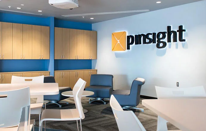
SPRINT & PINSIGHT MEDIA name and logo
Sprint, wanting to further expand its mobile advertising platform needed a new identity relating to, but separate, from the Sprint brand and identity. The Pinsight name and logo was inspired by the Sprint brand colors and typography with a subtle nod to the “pindrop” which the original Sprint logo visualizes (a falling pin). The brand was eventually acquired by Inmobi but the name and logo have been retained.
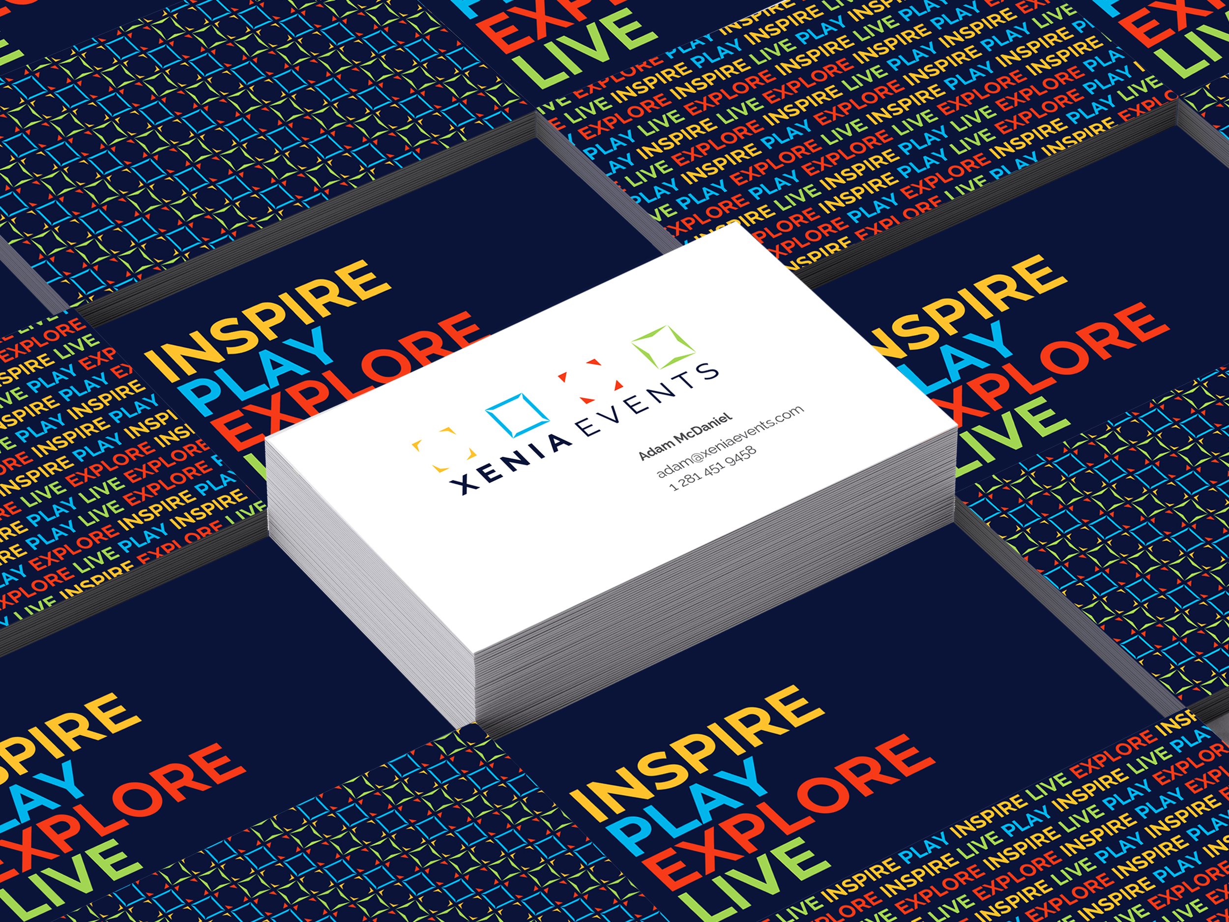
XENIA EVENTS brand development and expression
I designed the identity and branding for Xenia Events, a new ticketing agency specializing in four areas; sports, concerts, theater, and bucket-list travel. The brand identity was expressed through a series of frames, each unique in its corners and a subtle reference to the “X” shape. Inspired by passion to capture and share experiences on social media, the squares serve as a framing device across all photography. Images are always active, playful, elegant or dramatic and take on one of the hues from the logo mark.
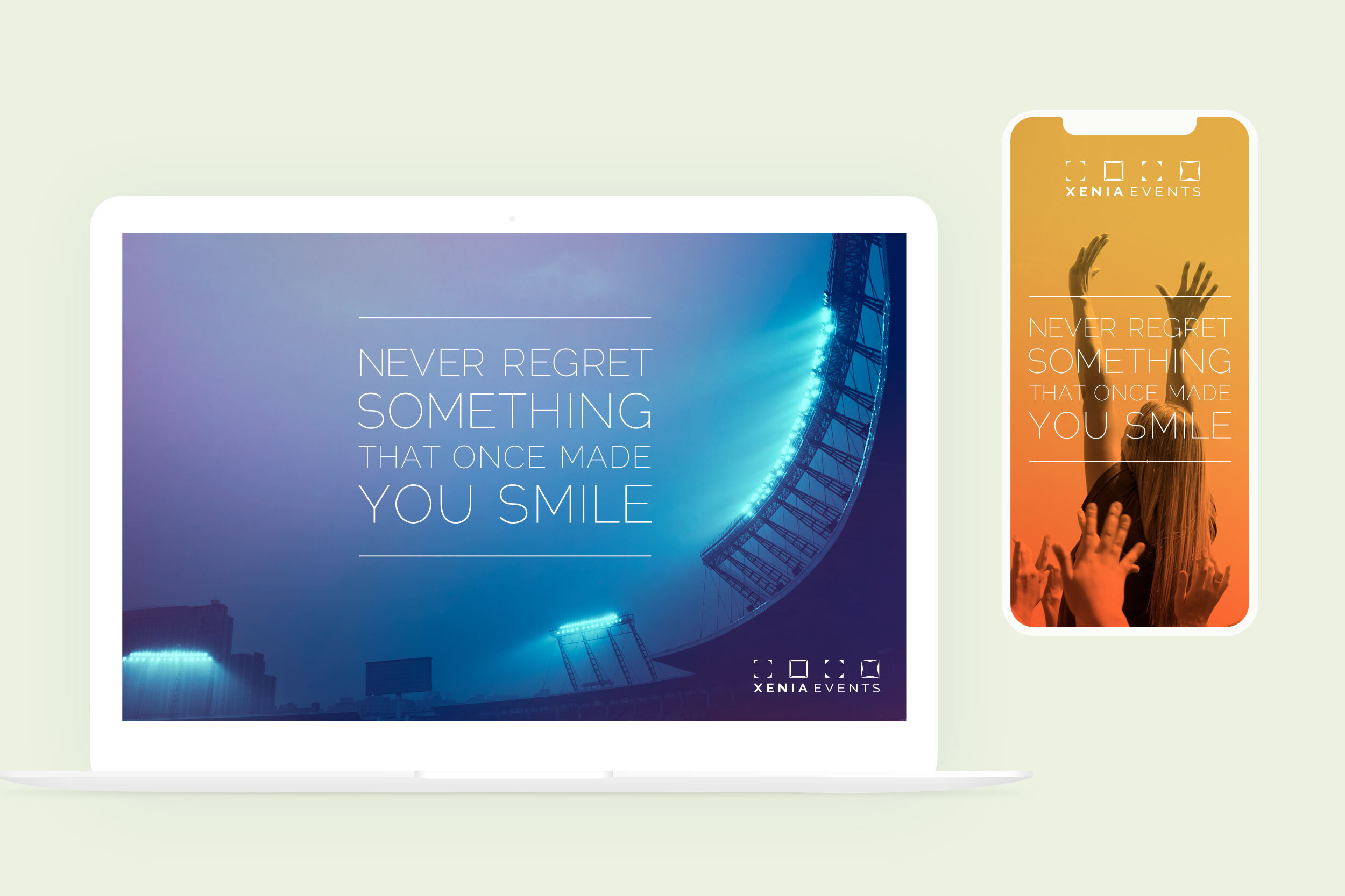
CAPTURING AND FRAMING MOMENTS
The modular identity system is comprised of four squares that become a framing device for imagery and is representative of the four offerings, sports, concerts, theater, and bucket-list travel.
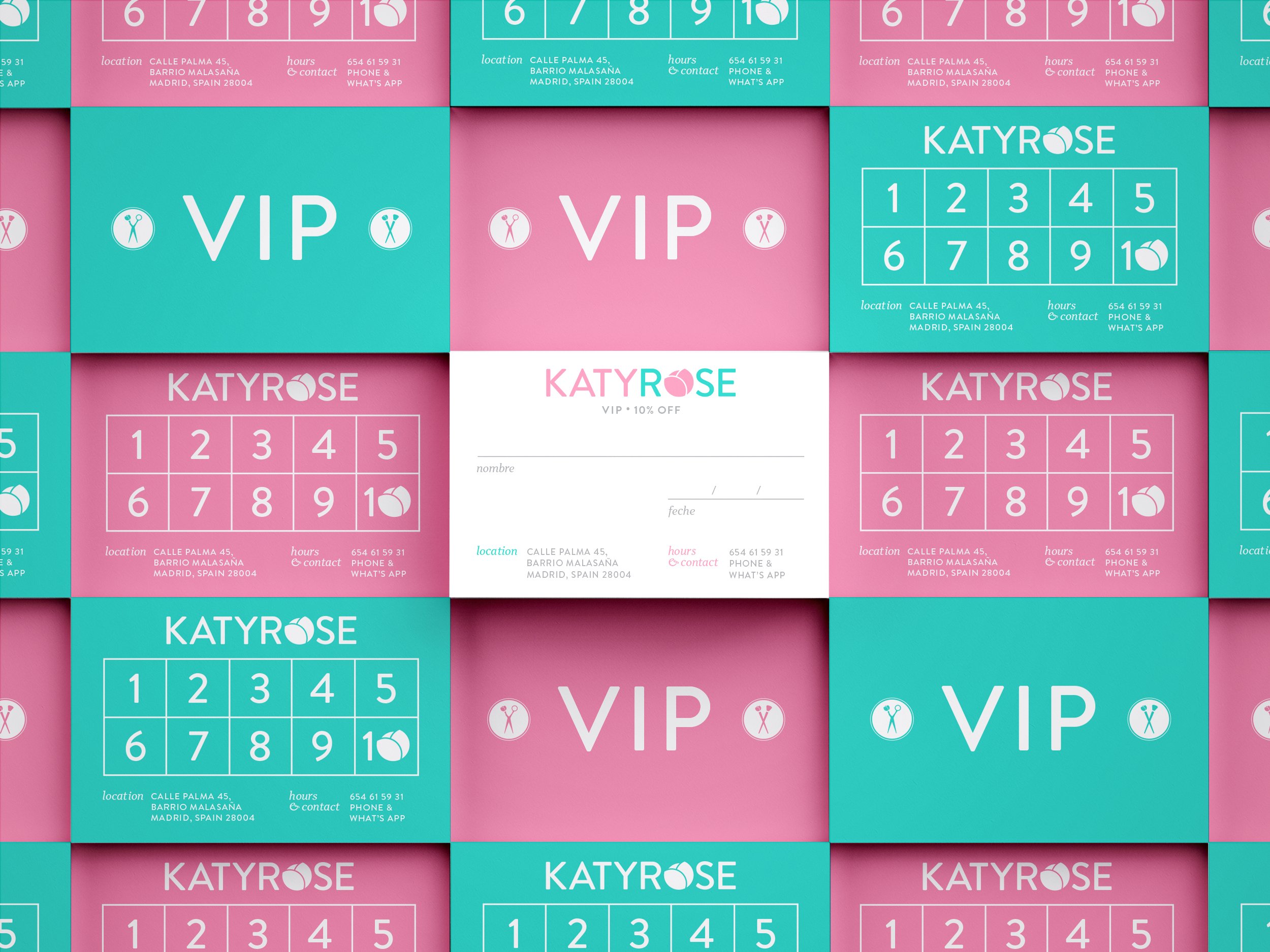
KATY ROSE HAIR & MAKEUP brand development and expression in Madrid, Spain
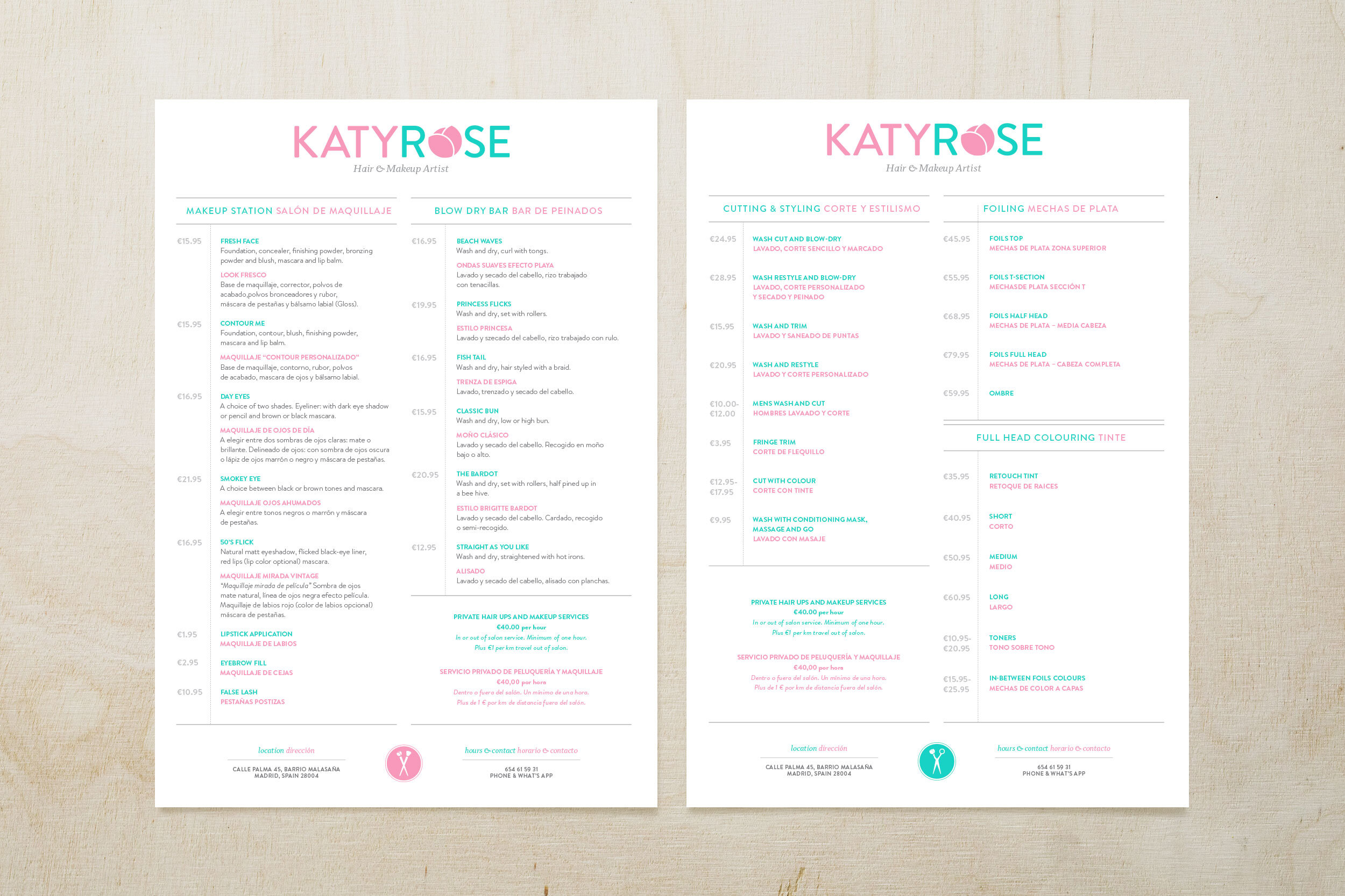
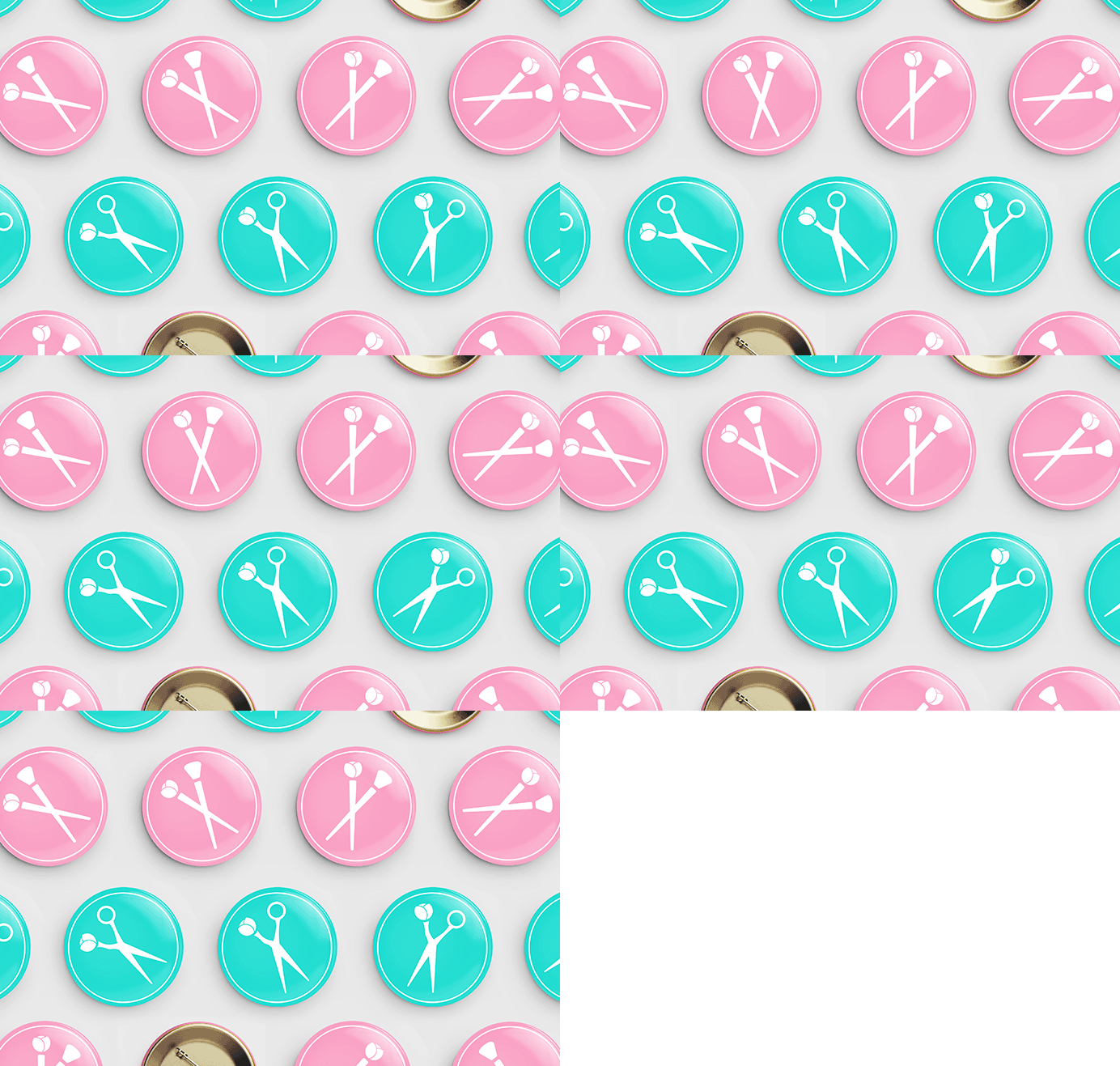
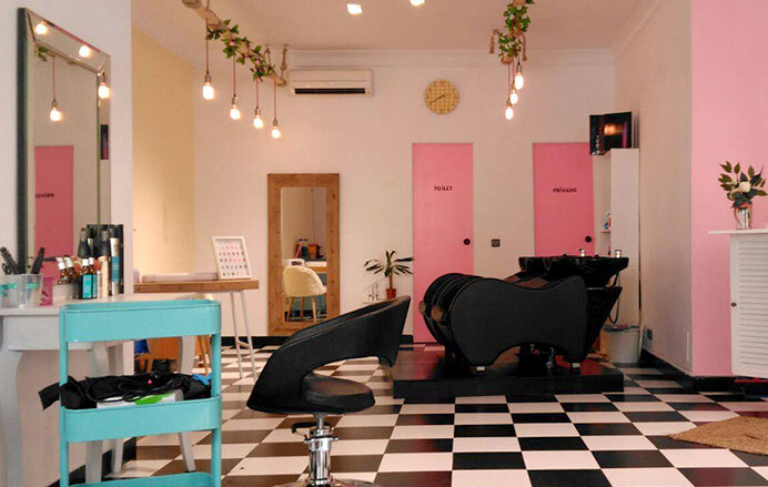
Katy Rose is a British hairdresser and makeup artist who left the rainy skies of London for the sunny skies of Spain. She wanted a trendy brand for her new salon in the hip Malasaña barrio of Madrid. The logo is comprised of bold type, cheerful colors and an icon system always punctuated by the rose. The two colors help customers quickly scan for language, pink/English and teal/Spanish since the salon caters to both Spaniards and ExPat Brits and Americans living and studying abroad. The name, the rose, and the icons are continually interchangeable, keeping her spirited brand young and playful, perfectly fitting with the hip nature of the neighborhood and her shabby chic salon.
SANDERS FAMILY DENTAL
This playful logo was designed for a family dental practice outside Chicago. The logo lives in the same spot on both the front and back of the business card. On the back of the card, the heart happy tooth reverses out in a subtle nod to an x-ray. This fun, quick turn project was an important undertaking. Because this particular dental practice offers sedation for highly anxious patients, as well as specializing in pediatric dentistry, it was important that the logo express the kind of care and empathy they take in easing patient’s fear.
MOONSAIL NORTH
Moonsail North is a minority-owned storytelling and strategy agency. They came to me with the name in hand and an idea of the color palette they wanted to work within. The words were fun to play with in this brand/logo expression.

