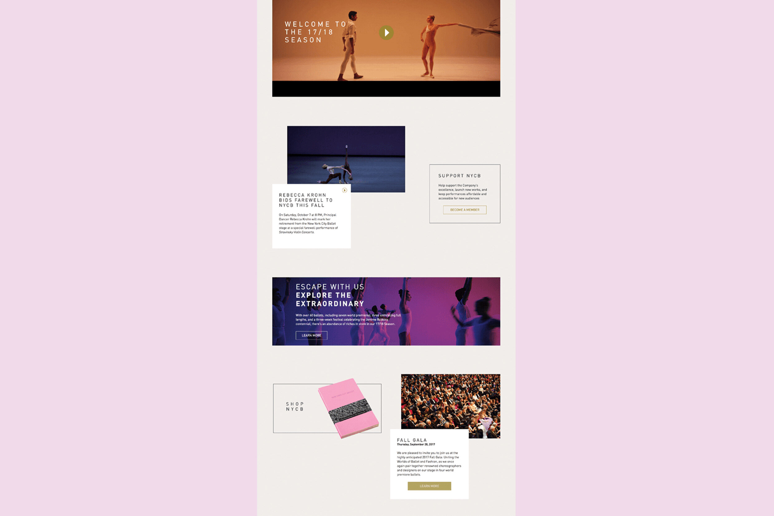
NEW YORK CITY BALLET digital redesign
As the creative director leading the re-design of the New York City Ballet, I wanted to honor Paula Scher’s original intent for this prestigious brand. Tension and drama. I began my process by reading Pentagram’s case study. Collaborating closely with the NYCB marketing and design team we used fashion forward photos of the dancers that were dynamically cropped, creating tension. Inspired by the natural movement of dance, the site subtly animated as the user scrolls.


MAPPING IT OUT
After research and setting a creative direction codified in a brief, we collected artifacts and images filling a wall with inspiration. We organized according to style types, color, navigation, typography and images. Using post-its we discussed at length best practices, and considered different visual approaches such as bold use of color or typography.
SKETCHING IT OUT
One hurdle with this particular brand is there were various stakeholders who needed their content to be visible. Ticket sales are just as important as fund-raising and events are just as important as community outreach. We considered how and where modules would live on the homepage, those that were further down the page were “sticky” and follow the user down. This was a compromise we settled on, a module might not be the first thing a user sees, but it will be the longest thing a user sees. From here we moved into visual design and prototyping.


